A landing page is a stand-alone page that truly dedicated to the product. A landing page drive attention of customers for the product. A landing page helps a customer to know more about the product or service and also provide a way to let the customer in. But understanding the landing page will help to drive more conversion rate.
Table of Contents
Why Landing Page Matters?
It’s the first thought that comes to mind, does a landing page is the right way to promote the product/service? The answer is simple, yes. We all know that a landing page is the best method to represent a product even through time, trends are changed. The only thing changed is the design of the landing page.
A landing page help customer to know all things about the product. Like how it works, purpose of the product, story behind it, case study, customer reviews, price plans and how to get it. It designs in such a manner that customer gets clear all queries related to the product.
The main difference between a landing page and normal product page is that it tells about only one thing, the product. While other pages recommended and upsell other product also.
I am pretty sure that you get why a landing page matter in digital marketing. But some science increases the conversion rate. once you get that, your landing page will never fail.
Design flow of Landing Page
 The should be a way to represent your product and for that, we need a structural layout. A layout, on scrolling page, customer get all things about the product. Only on scrolling from top to bottom, customer clear all queries. If your landing fails to do it, the promotion also gets fail.
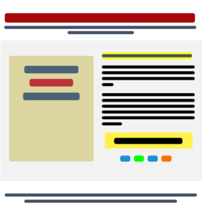
For a better design flow, elements of the landing page should be like this.
- Impressive headings
- Eye-catching visuals
- Details about product
- Case Studies
- Customer reviews
- Contact Form
- Call To Action (CTA)
Make sure that all your sections should be engaging enough that they navigate a customer to Call to Action.
Page speed and mobile adopted layout
Customer hates waiting.
Page loading time should be 2-3 sec. More waiting, more chances that customer jump-out. As landing page contains many visuals to represent product, so lazy loading, image optimisation helps a lot.
Also, several surveys and study show that, nowadays, people prefer a mobile device to shop online. So your landing must be impressive and fully optimized for mobile devices also. On mobile-view it must cover all the things and must be visible to the customer.
Improvement in UX
In today’s era, the design does not matter much. UX is dominating. UX is an overall experience that the reader gets while and after accessing a webpage.
For example, if you are using a contact form in the landing page, then contact fields should be genuine. Just, for example, most of the people hesitate to provide a mobile number in the form. If email is enough to contact back, no need for asking mobile number. Also, how much time taken to response on query also matter. It provides trust to the customer. So that they buy the product even have a query.
High-Quality Media
Visuals are the best way to impress readers without reading. Good quality of images makes your landing page more professional. A professional presentation attracts customers and also build trust in customer about the quality of the product.
If you are using a video then it must be brand level creative and revealing enough to tell the main things about the product.
All media must be optimized and follow the color theme of the landing page. Using perfect media make a landing page to the next level.
Call to Action (CTA)
CTA is the main part of a landing page. Because it is covert customer. So CTA must be impressing in all the angles, like design-wise, text-wise, contrast-wise. There is some point that one keep in mind for CTA.
- CTA must be pop.
- The color theme must be matched with the landing page.
- CTA text should be straightforward and impressive.
- Use colour-code to attract customer.
- CTA can use blue colour for trust, red for excitement and orange for friendly nature.
- CTA button text also matters, like in Subscribe and Get Free Newsletter, one always prefer 2nd.
On mobile-view it must cover all the things and must be visible to the customer. One recommendation is to also use a URL shortener to track how your CTA’s perform.
The Closing Words
When we promoting a product, by any means, it lands on the landing page. Email Marketing, ad campaign do their work but if our landing page is not perfect then, the conversion rate goes down. So we must know to deal with the landing page. It’s not rocket science, just a simple way to represent our product. Once the landing page becomes better, our conversion rate goes to the peak.


Leave Your Comment Here